US Equity Market Valuation Pulse
(Last Updated September 29th, 2020)
| Valuation Metric | Historical Valuation | |
| CAPE Ratio (P/E 10) | 30.63 | HIGH |
| Market/GDP Ratio (aka Buffet Indicator) |
175.6% | SIGNIFICANTLY OVERVALUED |
| US Equity Risk Premium | 2.61% | MODERATE |
| 10 year-3 month yield curve | 0.65% | POSITIVE |
ReturnOnTime’s views on 9/29/2020: The market remains in a small correction though has shown some signs of recovery. While many parts of the market remain significantly overvalued, there is a number of strong stocks to invest in that are still significantly down since the pandemic started. Now more than ever before, investing requires building a highly diversified portfolio that can capture returns across asset classes, industries, AND various countries for the best possible outcome.
Check out some 2020 investing insights in these articles:
When Will The Stock Market Crash?
The 60/40 Portfolio Is Dead
Build Wealth With Set & Forget Investing
3 Stocks For Investing In The Recovery
Tesla Stock Price Goes to Mars
Big Tech Dominates The Stock Market
Value vs Growth Stocks in 2020
Government Sponsored Bubbles in 2020
WAIT – What the heck does any of this mean? We’ve got you covered.
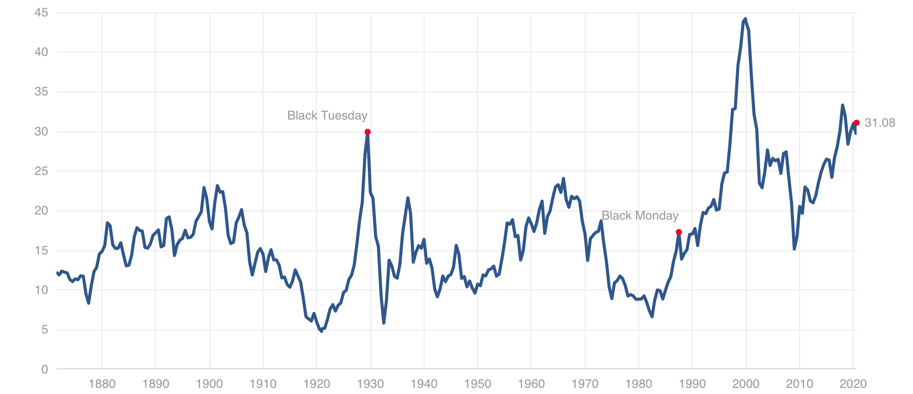
CAPE Ratio (P/E 10)
The P/E ratio (price to earnings ratio) is commonly used to value a public company. It measures the current share price relative to its earnings per share (EPS). Typically, the P/E ratio is based on either the past 12 months of financial results or the expected forward 12 months of financial results.
The P/E10 ratio, also known as the CAPE or cyclically adjusted price to earnings ratio, represents the price to average earnings from the past 10 years. It is less prone to wild swings since it does not reflect just one year of results like the typical P/E ratio.
The CAPE ratio has proved useful in identifying points in history where stocks, in general, have been overvalued or in bubble territory. The CAPE ratio has hit record-high levels at 3 important times in the past: 1929 at the beginning of the Great Depression, the late 1990s right before the huge DotCom Crash, and 2020 presently is the second highest CAPE Ratio in history. In our opinion, the CAPE ratio is a strong indicator of performance over the next 10 years rather than an indicator of how stocks will perform in the short term. In the short term, stocks may continue to remain or grow even more overvalued.
Here is the current historical graph of CAPE Ratios since the late 1800s (as of August 10th, 2020):
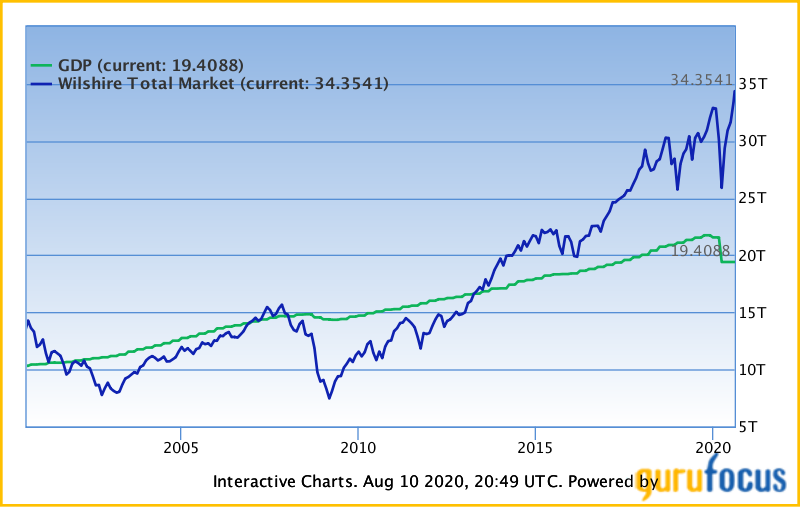
Market Cap/GDP Ratio
The market cap/GDP ratio measures the Wilshire 5000 market capitalization to US Gross Domestic Product (GDP).
Market capitalization is basically the total monetary value of a company, or index. For example, Apple, as one company has a market cap of $1.93T. Put another way, Apple is worth $1.93T in the stock market.
The Wilshire 5000 is the market value of ALL US stocks actively traded in the United States. This differs from the S&P500 which only measures 500 stocks in the US.
Gross domestic product (GDP) measures the total value of good produced and services provided in a country. Usually, this is measured over a period of time like a quarter or a year.
The Market Cap/GDP ratio, also known as the Buffet indicator, is the Wilshire 5000 total market cap divided by US GDP. Depending on this ratio, there is a consensus on the expected returns from investing over the next decade.
GuruFocus has divided market valuation into 5 zones:
| Ratio = Total Market Cap / GDP | Valuation |
|---|---|
| Ratio ≤ 72% | Significantly Undervalued |
| 72% < Ratio ≤ 93% | Modestly Undervalued |
| 93% < Ratio ≤ 114% | Fair Valued |
| 114% < Ratio ≤ 134% | Modestly Overvalued |
| Ratio > 134% | Significantly Overvalued |
US Equity Risk Premium
Equity risk premiums refers to the excess return that investing in the stock market provides over a risk-free rate. Treasuries are considered risk free investments since they are backed by the US government, thus this is usually the difference between the expected returns on a diversified basket of stocks (like the S&P500) minus the expected return on risk-free 10 Year Treasury bonds. The equity risk premium can be measured differently investor to investor.
Given that the Federal Reserve has cut interest rates to 0% again, the 10 year Treasury is currently yielding 0.58%.
For the purposes of our definition, we will refer to the cyclically adjusted earnings yield of the S&P500 and subtract the 10 year treasury yield from that.
Thus, the current equity risk premium, as of August 10th, 2020, is 3.22% (cyclically adjusted earnings yield of the S&P500 = 1/CAPE Ratio) minus 0.58% or 2.64%.
10 Year-3 Month Yield Curve
The government borrows money in the form of Treasuries. Treasuries are US government bonds of varying duration from 1 month to 30 years. So, as of early August 2020, the US government may pay you 0.09% interest if you let them borrow $1,000 for 3 months, or they may pay you 0.579% interest if you let them borrow $1,000 for 10 years.
The 10 year-3 month yield curve is basically the difference between how much the government will pay you to borrow for 3 months as compared to 10 years. At certain times in history, we have seen cases where letting the government borrow your money for 3 months will pay you more interest than letting the government borrow your money for 10 years. For example, since March 2019, there have been a number of times where you would earn more for letting the government borrow your money for 3 months compared to 10 years. This is counterintuitive because you should always be paid more interest for letting the government borrow your money for a longer duration.
So, what does this really mean? When the 3 month yield exceeds the 10 month yield for at least a quarter, it’s typically an early indicator of an economic slowdown and impending recession. This indicator is 18 months early on average and has predicted every recession since the 1950s, including the current 2020 recession.
During a recession, we typically see the yield curve turn positive again as the Federal Reserve cuts interest rates to stimulate the economy out of the recession. Generally a positive yield curve implies economic expansion or growth.